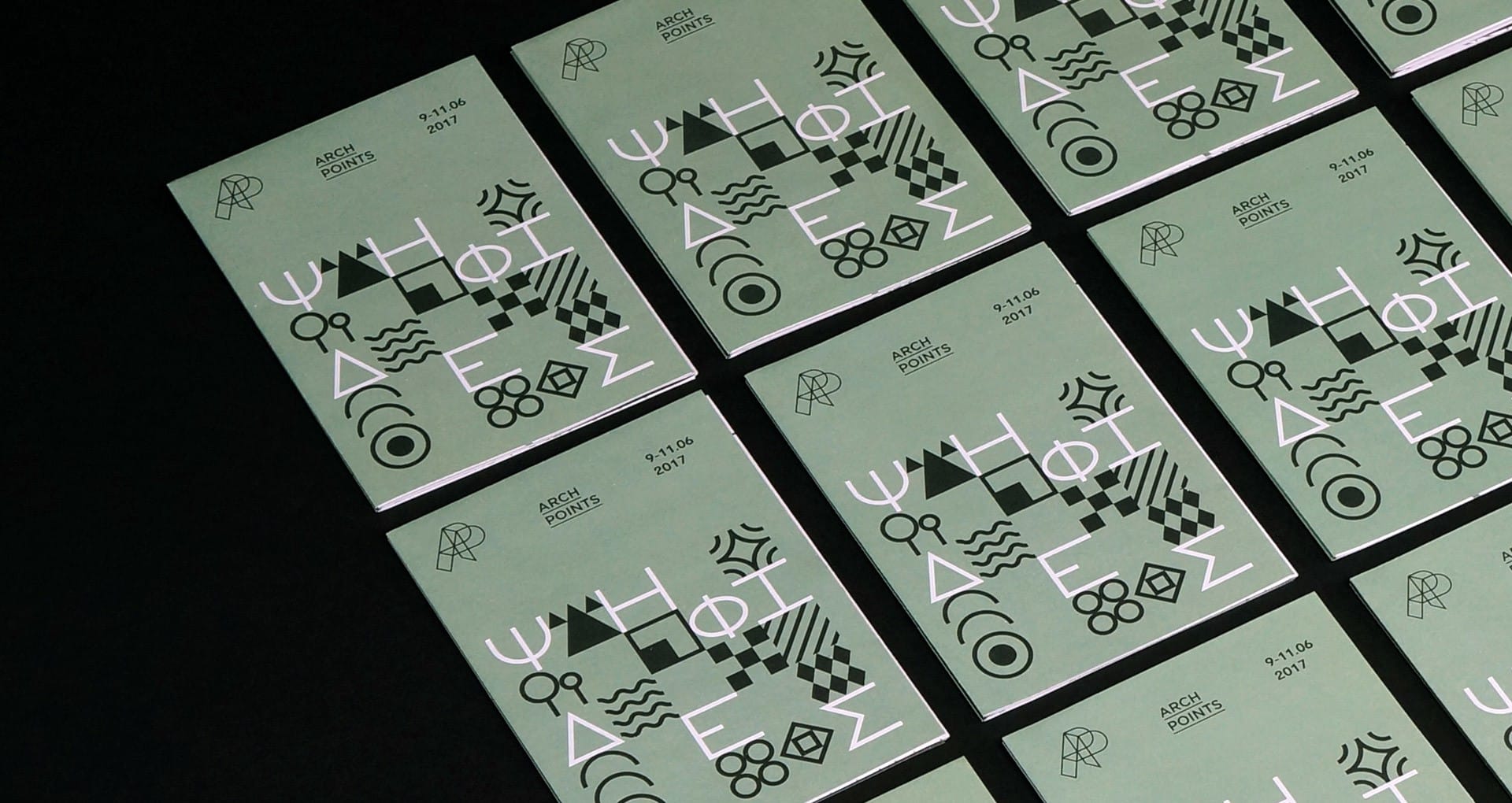
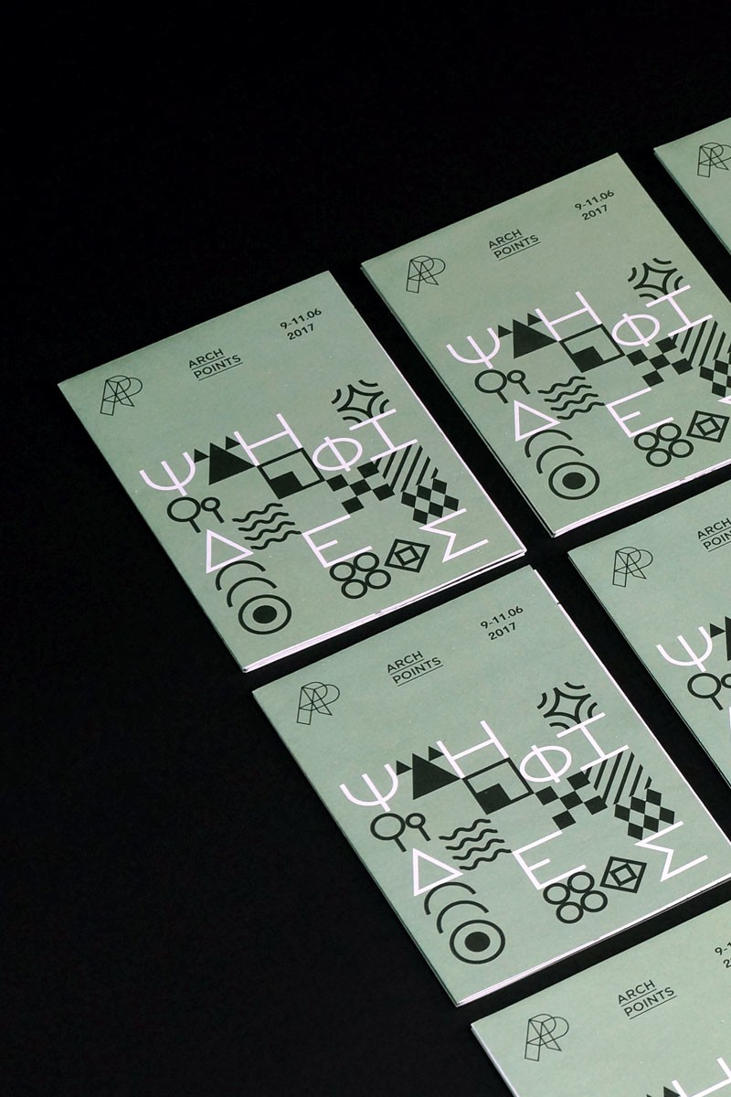
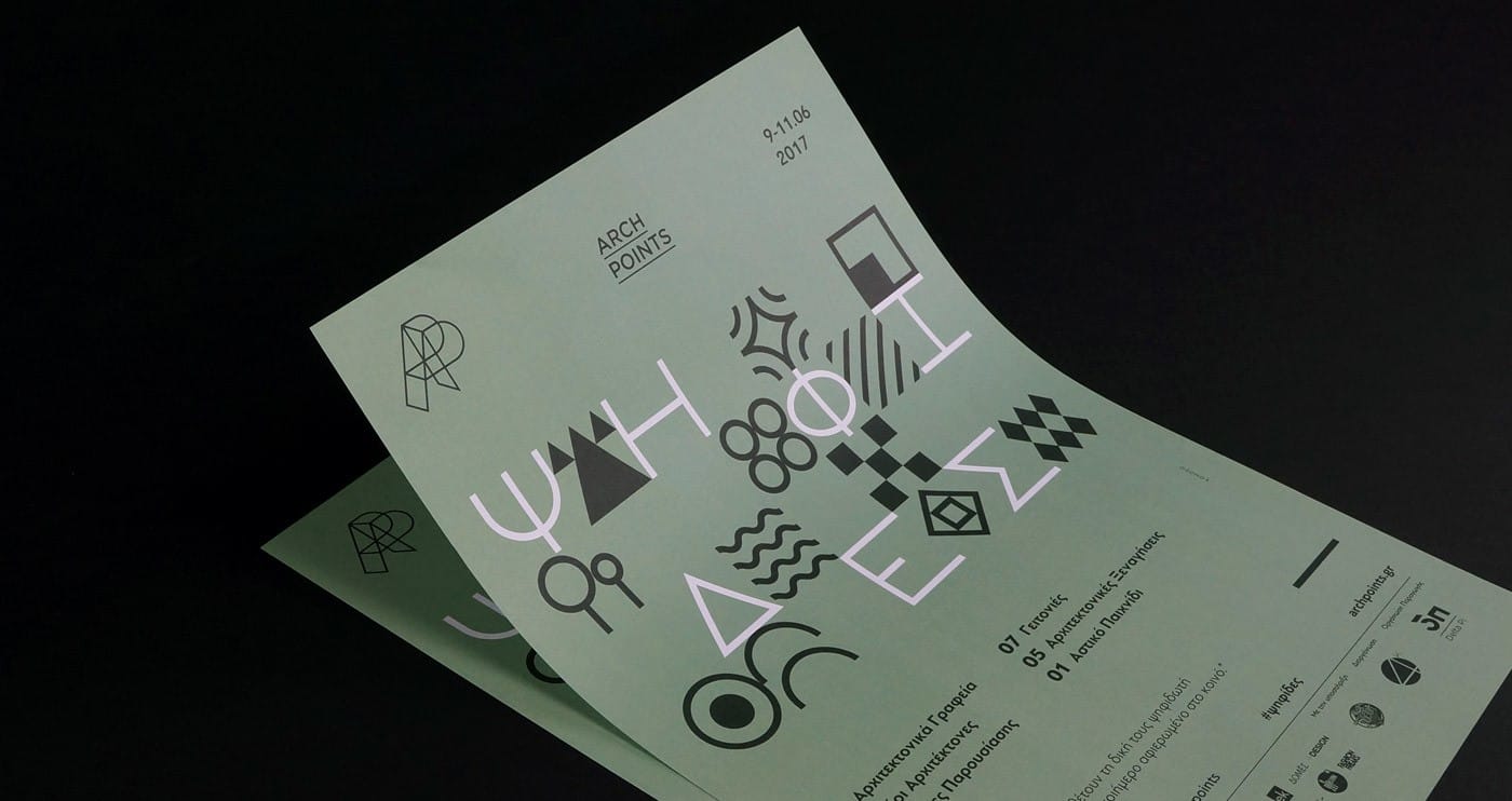
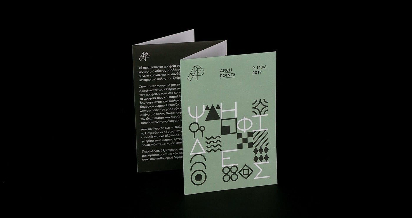
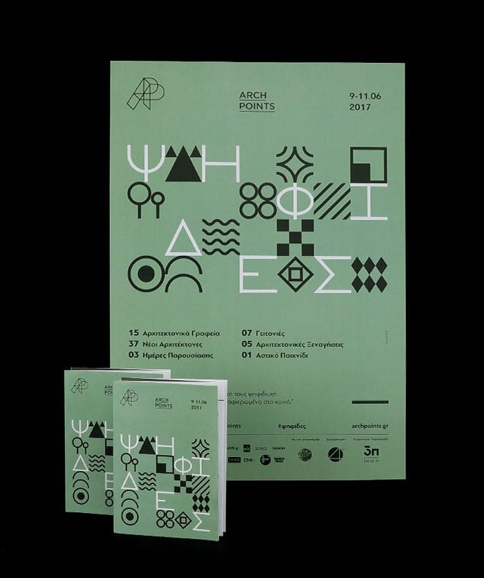
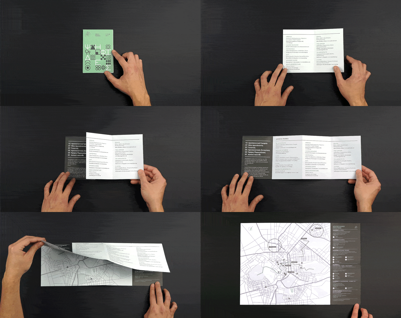
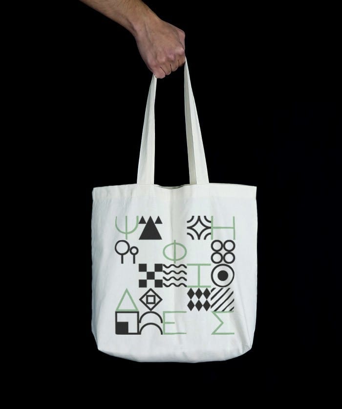
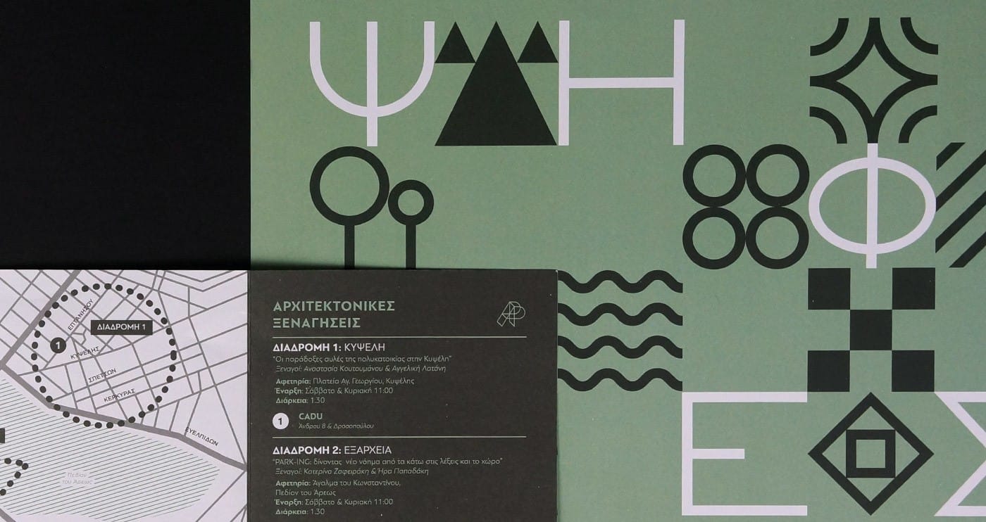
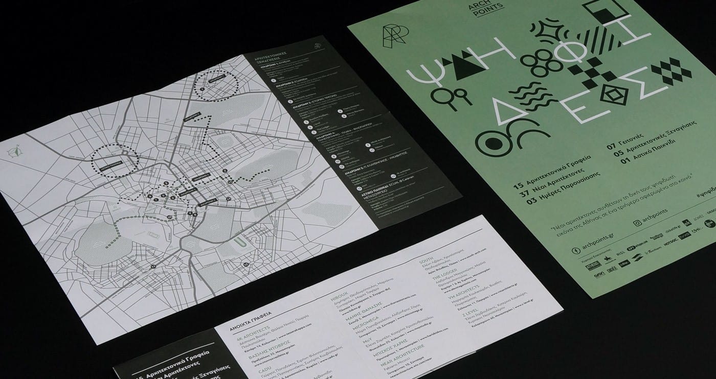
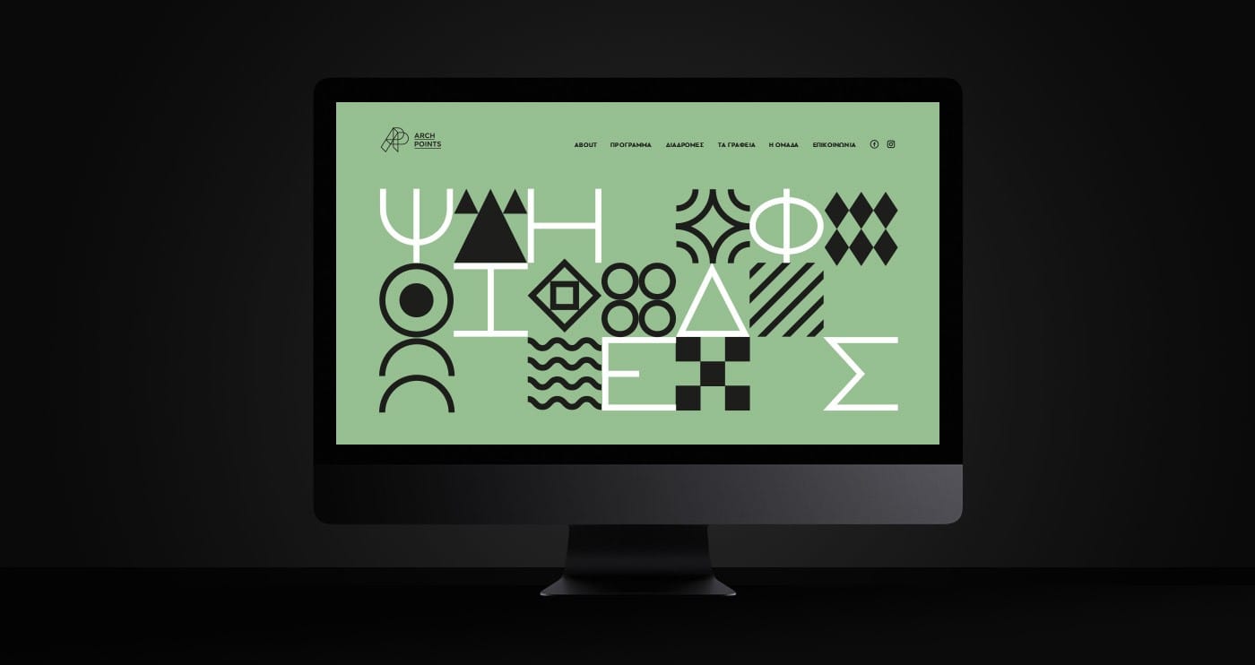
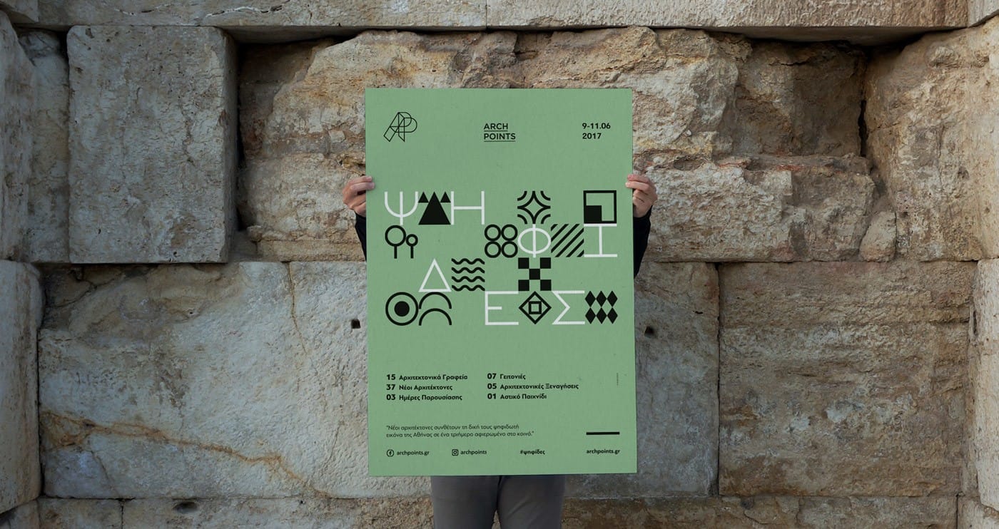
For the second edition of the event, we designed a communication campaign based on the 2017 theme, “Psifides”, which is Greek for mosaic tiles. We created a modular, grid-based identity using typography and icons.
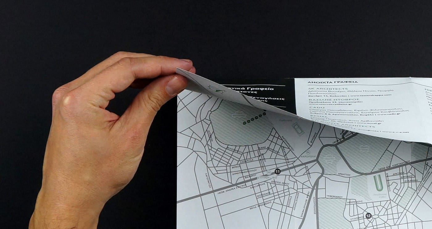
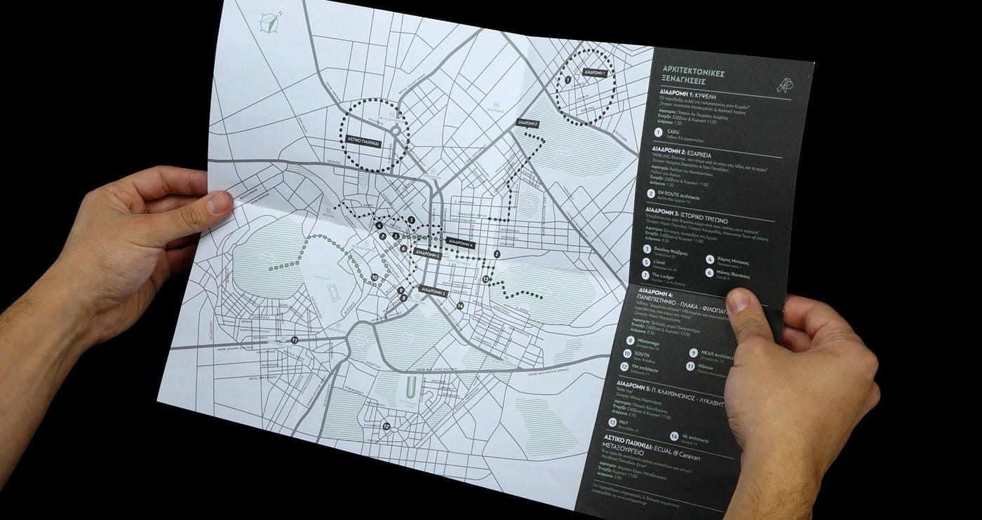
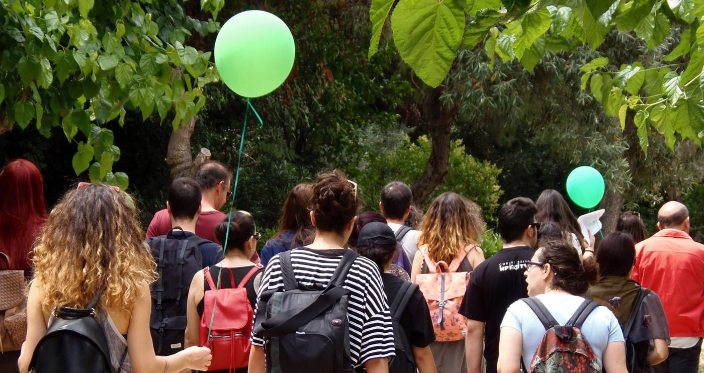
The return of Arch Points was marked by a fresh crop of downtown architecture studios that opened their doors to the public, inviting visitors in to acquaint themselves with their work. Each studio proposed small-scale projects that improved on the city’s urban environment, while the event also offered architecture tours around town, inviting city dwellers to fall in love with Athens all over again.
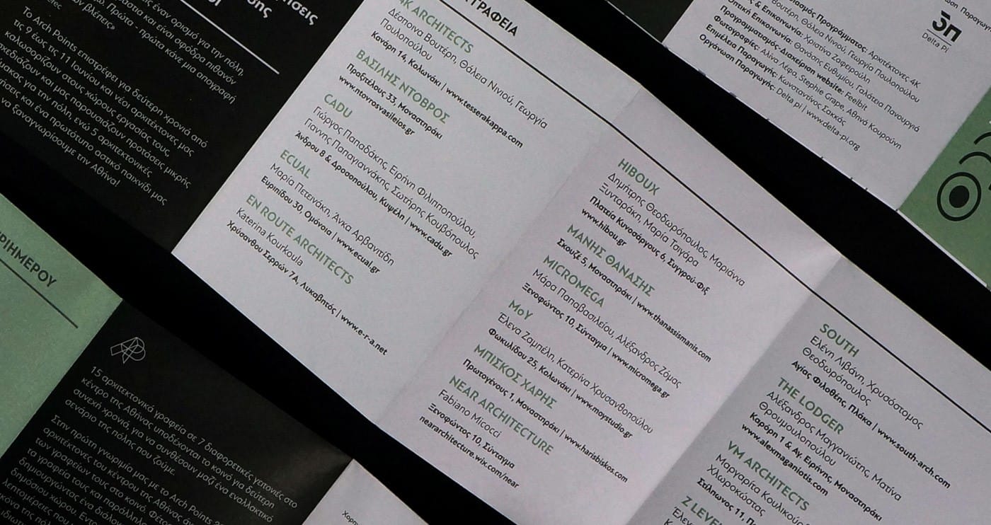
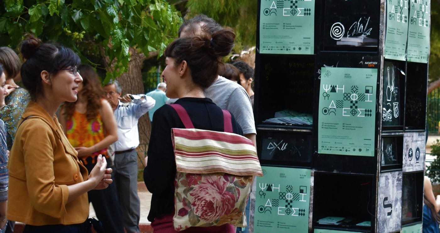
The Arch Points 2017 campaign was a play on typography and illustration based on the mosaic tile theme of the festival, “Psifides”. The visual identity was implemented throughout the printed and digital materials, including the flyers, the poster, the promo video, the website etc., keeping everything cohesive.

